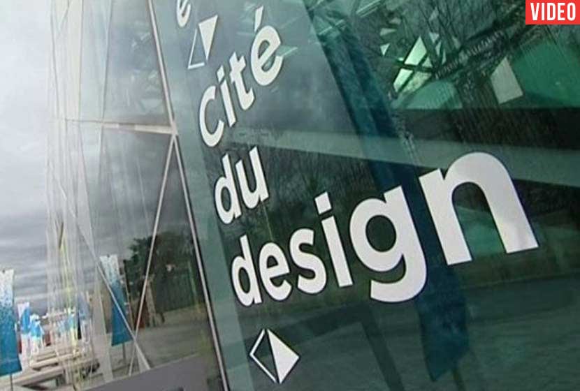
Is a manhole cover beautiful? Why would it be? Who would know that it carries a secret intelligence, an invisible detail? In plain sight, in front of us, everything is hidden. The exhibition "No Randomness" (Nothing is by chance) by Oscar Lhermitte, at the Saint-Etienne International Design Biennial, is designed as a tribute to objects camouflaged in the landscape and offers you the opportunity to experience their discovery. No Randomness is concerned with highlighting unnoticed objects because, far from being random or arbitrary, they are always the result of a ferociously intelligent design.
A beauty hidden in detail, to be discovered. Deciding on the beauty of an object is not an easy task. Sometimes it is easier to know what you find ugly. To take into account the coherence of a product, on the other hand, is to observe the judicious way in which it fits into its environment. Understanding the reason for this or that detail, becoming aware that it is not part of the object by chance...
This is a collection of invisible objects. Undressing and questioning the object is an integral part of the designer's job. The 19 objects gathered in this exhibition form the beginning of a collection of objects that all have an "invisible" detail that allows them to fulfill their role perfectly. Beauty must lie in their simplicity, their stroke of genius. It is a beauty that we celebrate every time we use them without noticing it. Without saying that these objects are perfect or irreplaceable, they do, however, have an exceptional point in common. They tell us about a design that makes the complicated simple without even boasting about it.
The fire bucket
 Although fire extinguishers are more common today, many of these fire buckets still exist. The bucket hangs on a hook because its rounded bottom does not allow it to stand upright and makes it unsuitable for any other use. It therefore always remains where it is to be used as a fire bucket. On the other hand, the rounded bottom allows a much more precise trajectory when throwing water on the flame. The object seems harmless. It is in fact a very simple solution to problems that may have arisen (buckets stolen or missing during a fire). There is no need to transform the object in depth: only the designer's creative intuition allows the fire bucket to continue to fulfil its function perfectly.
Stop sign - Octagon
 In the early days of road signage, the more angles the shape of a sign contained, the greater the danger. Little by little, the signs became more uniform around three shapes - the circle, the triangle and the square - leaving only one octagon: the stop sign. This specificity allows drivers to recognize it instantly anywhere in the world and in all weathers. It can also be seen from behind by motorists arriving on the other side of the road. Regarded as one of the most important signs in the highway code, its unique octagonal shape has made it an icon. No need to speak English (except in Quebec where the word stop is replaced by stop)The design of its silhouette, by playing on its shape more than on the pictogram, gives it immediate and universal recognition.
Tyre tread
 Is the tread pattern of a tyre that leaves such a special mark on the ground there to give the vehicle a special look? In fact, the design of each sipes of the tread meets exclusively functional needs. Whether it is to prevent aquaplaning (good tyres can eject fifteen litres of water per second), increase steering precision, promote grip in corners, or limit resistance points with the ground to minimise fuel consumption, a vast know-how of design and technology is contained in the manufacture of the tread.
As the tyre is the only contact of the car with the ground, the tread is a fundamental part of the vehicle that can only afford the luxury of functionality. Yet it is nonetheless a beautiful and aesthetic motif made up of details, hollows and lines that disturb common sense while reminding us that a road is anything but round.
Italian pasta
 If ergonomics is concerned with the relationship between man and his objects so as to increase their efficiency and comfort of use, then Italian pasta is a little-known symbol of this. In each model of pasta, form follows function. A given shape makes it possible to capture the sauce in a certain way, to cook in a certain time or to distribute the heat better. For example, the dough penne is tubular in shape to allow less liquid sauces to penetrate inside. It is grooved to promote even cooking over the entire surface and is bevelled at 45° to obtain a hole wider than a perpendicular cut and thus allow the introduction of pieces of meat. In the world of Italian pasta, what appears to be an aesthetic choice always has an ergonomic explanation. This is why each pasta design has its own sauce.
Nonic Beer Glass - Bulging
 Design sometimes has its place in a gesture as innocuous as toasting. The small elbow characteristic of the nonic beer glass first of all allows a better grip, although this detail has an even more subtle impact: the elbow also creates a slight gap of 2mm between the top of two glasses side by side, so that if these glasses collide, the more fragile edge of the glass does not break. Then, once the contents of this glass are finished and when it is time to stack all the glasses, they don't get stuck because, here again, the elbow allows air to circulate. Nonic glass is an amazing example of an everyday object that, without boasting, makes complicated simple.
It doesn't take much, a bulge of a few millimetres, an almost imperceptible increase in the diameter of the glass, and its function is magnified.
Crown plug 21 teeth
 The interest of the capsule is to offer a guarantee of freshness. The crown cork closes tightly around the neck and, once decapped, it cannot be reused. Today, all crown corks have the same number of teeth: 21. Previously, they had 24, but when the industry became automated, the capsules that ran on the mechanical belts started to get stuck in each other. In fact, in even numbers, the teeth of the cap come into contact without coming into gear. An odd number, on the other hand, allows the capsules to rotate with each other without getting jammed. The change is less, yet the effect is maximum. It has an element of mathematical beauty. The crown corks rotate on themselves, you might think they are dancing. In this number, 21, a whole is contained, from the hermetic closure to the coherence with its manufacturing process.
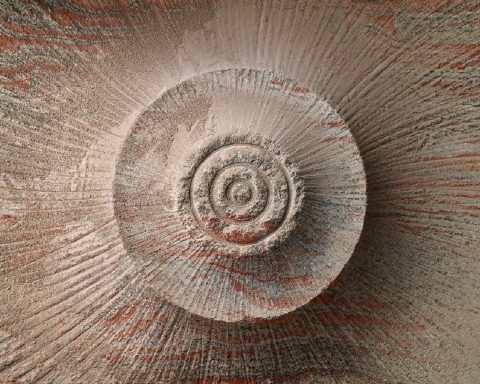
Turbojet engine - Spirale
 The spiral is a visual indicator that allows airport personnel to know whether an aircraft turbine is running or stopped. It is not possible to isolate the noise of a particular turbojet engine in the background turmoil and with noise cancelling headsets. If the spiral is not visible, ground personnel can be sure that the turbine is running. The spiral was chosen (rather than the cross, line or circle) because it is the shape that disappears the slowest in rotation. To distinguish it clearly, the turbine must be at a complete standstill. And when it turns on itself, the spiral has a hypnotic effect that catches the eye instantly. This makes it possible to provide a very simple solution to a safety problem without incurring great expense.
Egg bar
 Instinctively, the object appears unattractive. However, it is only the result of a cooking process. Hard-boiled eggs in bars are the result of a manufacturing process that consists of separating the whites from the yolks, cooking them in cylindrical moulds and then reassembling them. This process is used in the food service industry which has to provide salads, sandwiches and other dishes with slices of eggs with an equal proportion of white and yolk. The design then intervenes to propose a simple solution to an economic (waste reduction) and aesthetic (uniform slices) problem with little alteration to the quality of the product. Because it seems repulsive to us, the egg bar continues to ask us: what is it about it that bothers us?
Paris metro map - Topology
 The Paris metro map is not built on the geographical location of the metro stations but on a topological study of the intersections between the sixteen metro lines and the five RER lines. This system was first invented for the London Underground. It allowed a clearer and more intuitive legibility of the map. What catches the attention is the diversion of the common use of the object. The user generally expects a map to be realistic, but here the map is deliberately distorted. To fulfil its function, it is more interesting that it shows how to move from point A to point B, than to show the exact position of A in relation to B. This is why the metro map is inspired by electronic circuit diagrams, with straight lines and 45° or 90° angles, which make it aesthetically clean and easy to use.
Texts ©Oscar Lhermitte - Saint-Etienne International Design Biennial 2015
Photos UP' Magazine